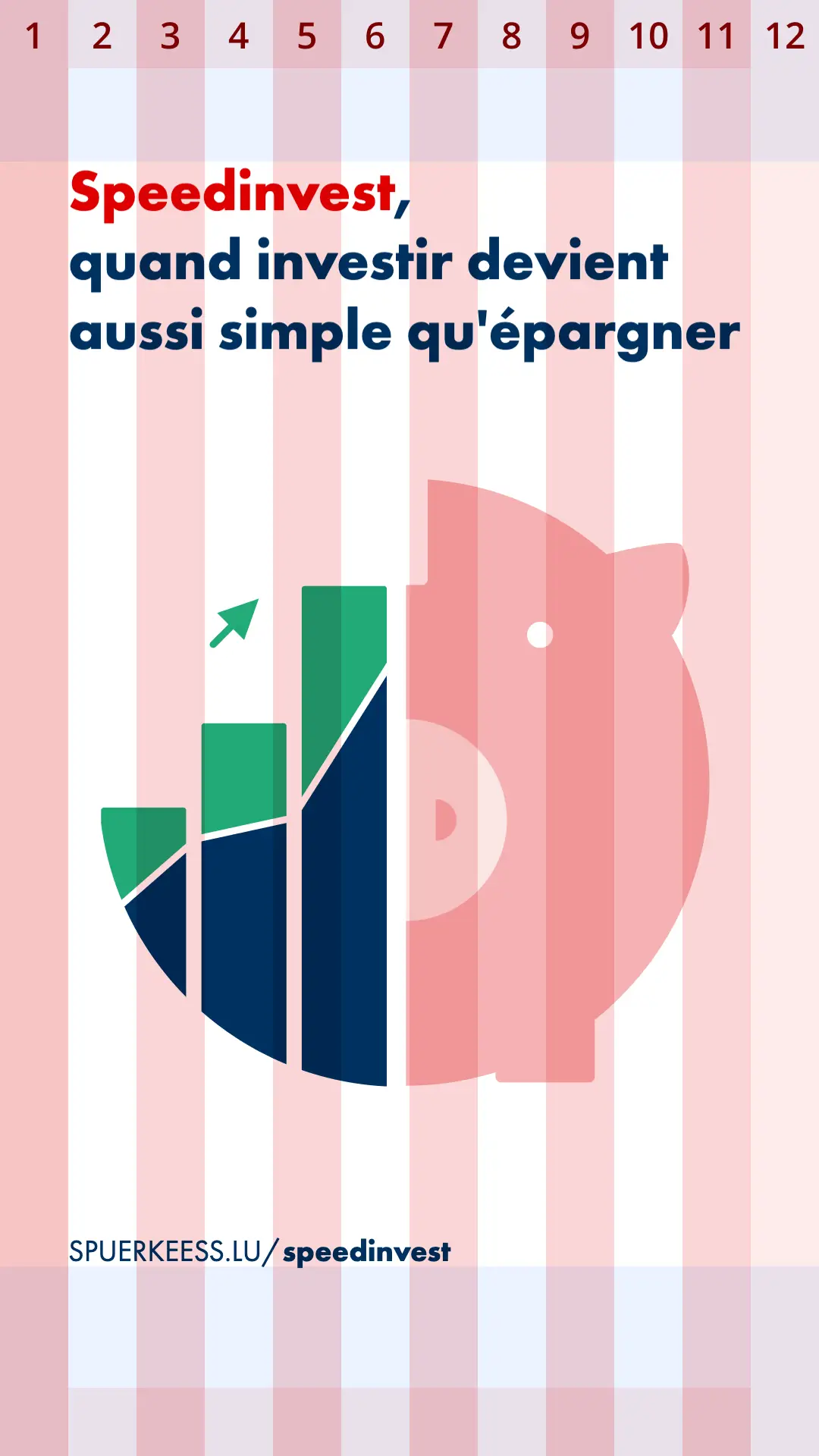
Print #
Spuerkeess’ print layouts follows the main spacing rules as the one present in the layout guide. The size of the logo icon will be used as a ruler the set the minimum amount of margins.
Annonces #
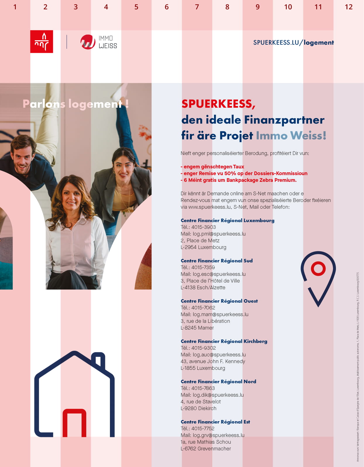


Invitation #

Campaign adverts #
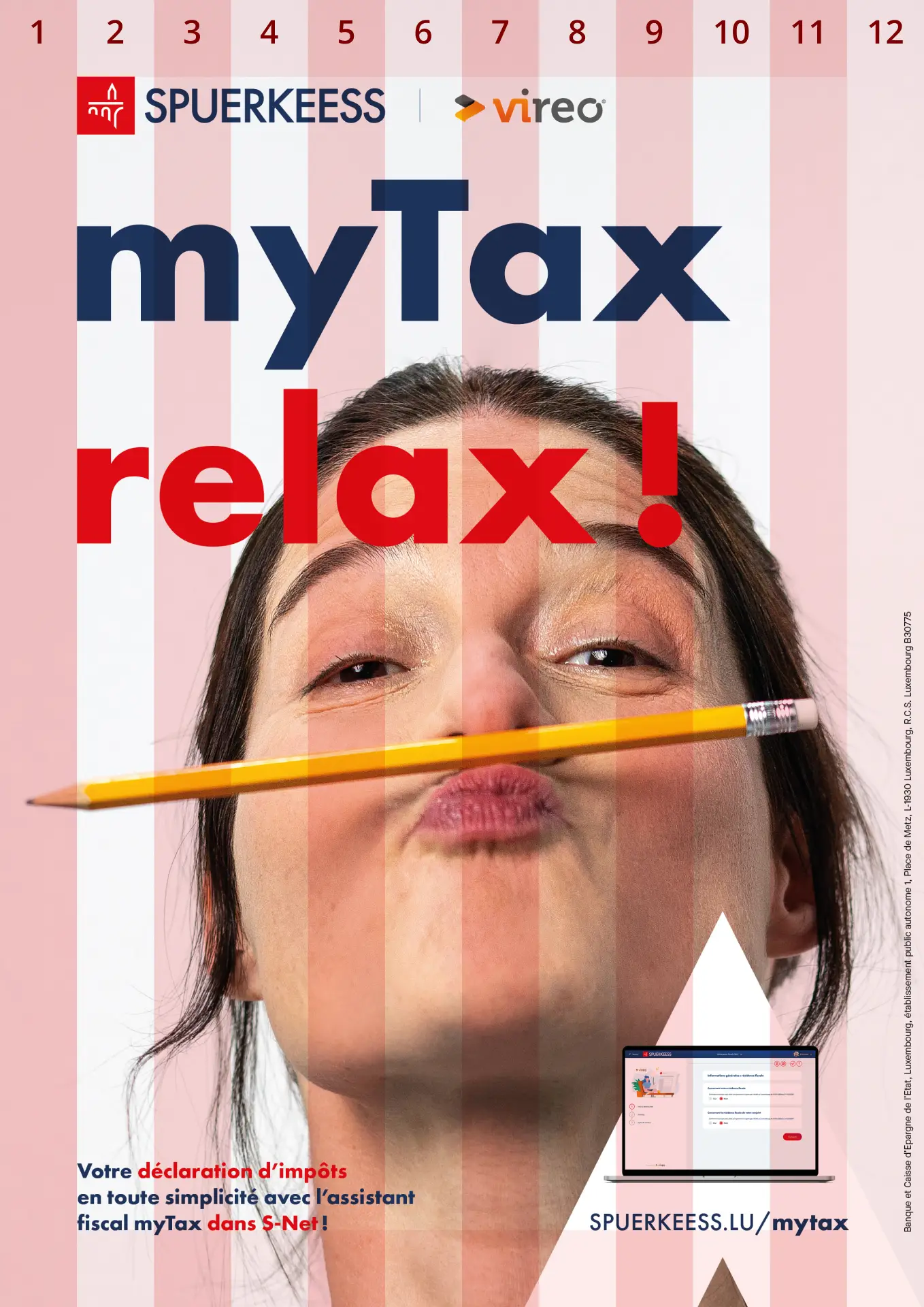
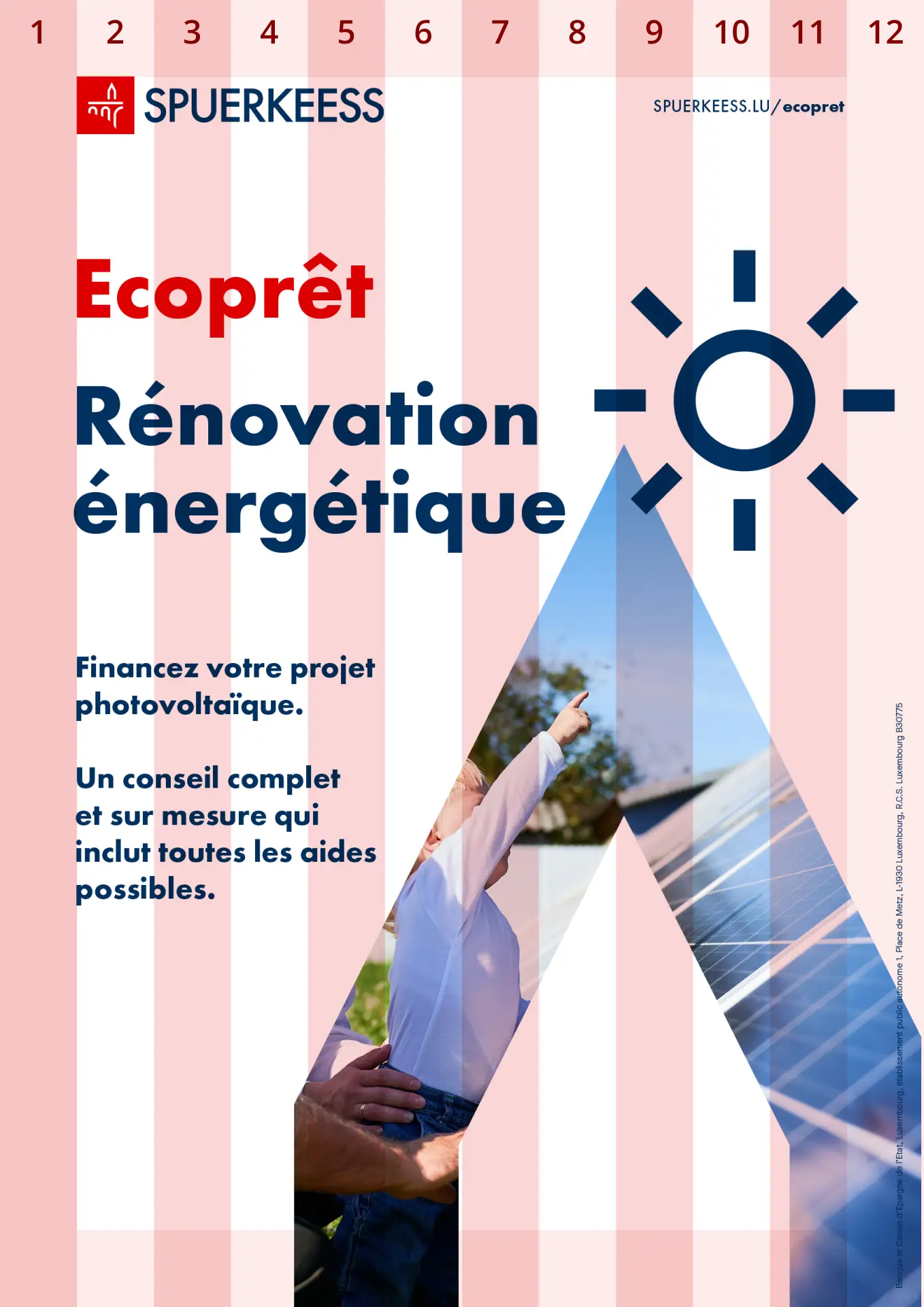
Hereunder two examples of how Campaign adverts are constructed.
Leaflet #
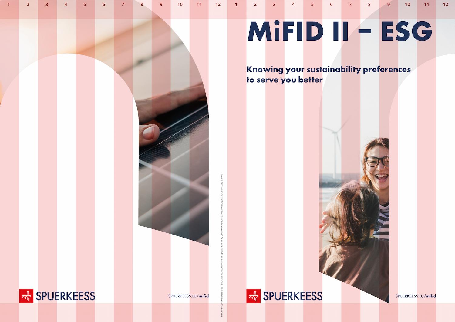
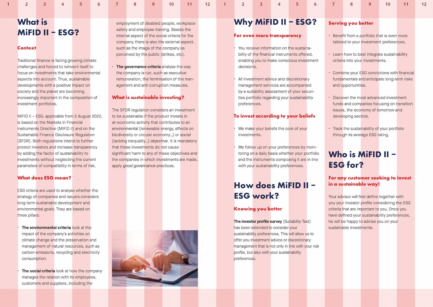
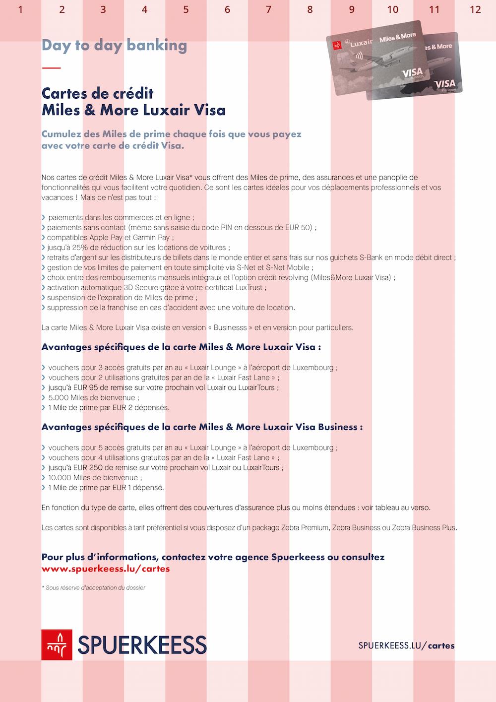
Factsheet #
Digital #
Spuerkeess’ digital media have different purposes and applications, but they all follow the same layout rules.
Digital Signage #
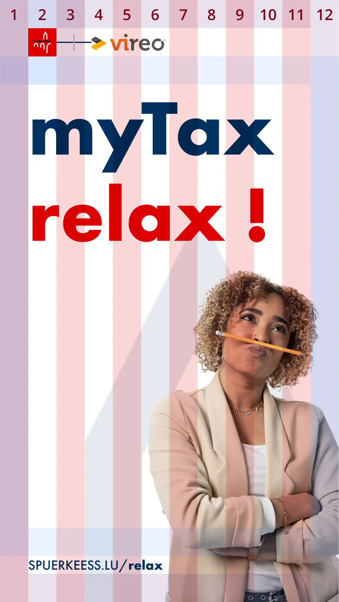
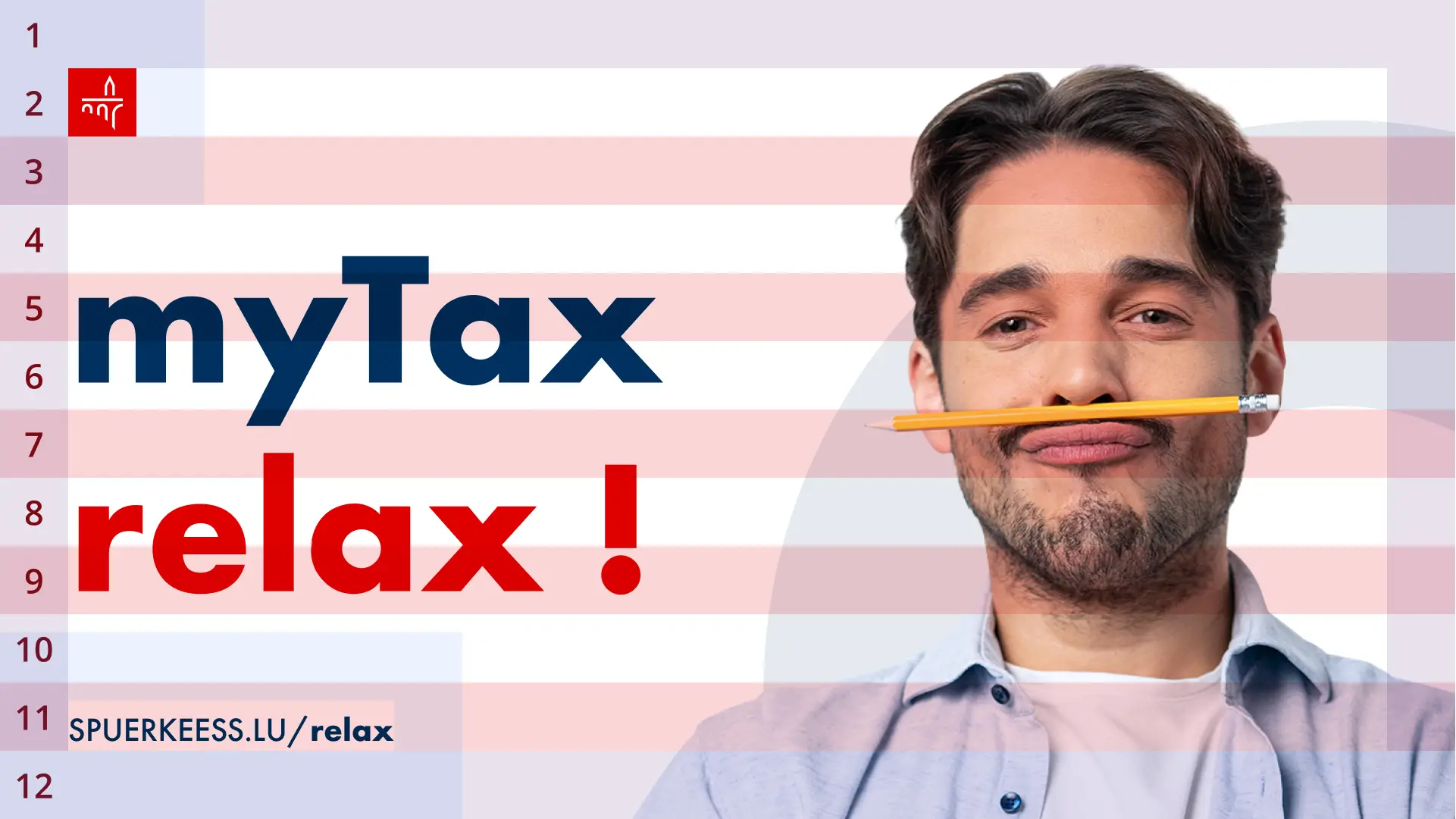
Digital signage is used inside and outside of the Spuerkeess branches hence making it, most often, unnecessary to showcase the Bank’s Wordmark except when promoting products or services outside Spuerkeess’ environment (for instance JCDecaux network or similar). In very special cases, the axxess logotype can be used without the red square, only when the Spuerkeess logo or any other logotype are already used on the same page.
When it comes to formats it is 1080x1920 for portrait and the opposite for landscape digital signages. The Logo Icon size is 100x100px. The Partner Logo, if in use, has to have a height of 100px. The Headline and the date sizes are 120pt while the Tagline as well as the URL are 48pt.
Banners #
Banners appear on digital supports, such as websites, that can be outside Spuerkeess’ environment, hence when this happens it is imperative to showcase the Bank’s Wordmark next to the Icon Logo.
Main spacing rule
Banners use slightly different rules compared to other layouts. The main rule being the spacing used to separate elements is always half the size of the Logo Icon. The only exception is for horizontal banners where the spacing between Spuerkeess’ Logo and the other content module is equal to the size of the Logo Icon.
Specific Web banners rules
The Icon Logo must be 40px.
The Ideal size for Headline is 30px while for the Tagline it’s 22px.
If the ideal sizes do not fit in smaller formats a range between the ideal size and the minimum size of 16px can be used instead.
Web banners format
Another difference are the format sizes which can vary depending on the partner website requirements:
- 300x600px, which is a standard portrait format
- 728x90px, small landscape format
- 840x250px, large landscape format
- 300x250px, nearly squared format
An additional content module
Banners also have an additional module which is a call to action button. The action button height is the same as the logo icon, 40px.
Banner examples


Social Media #
On social media, many different creative formats exist. To make these guidelines straightforward, the rule is simple: the spacing rules are the same as for the Layout rules with only three exceptions:
- Reference to the Spuerkeess Logo as spacer benchmark must be replaced by a square of 100x100px.
- The Headline size is 120pt and the Tagline is 48pt.
- The use of a Brand Logo is not required.
For the exact creative formats you should use on social media, we recommend you to consult each social media’s official guidelines.
